I was thinking of web design patterns that may be candidates for controls for use in Windows Presentation Foundation (WPF) apps, specifically the browser-hosted application flavors (XBAPs). I figure I should list the ones that I think are prevalent on the web first.
Bread crumb barsThis is what got me started. Hua and I were talking about this sample she started working on. Bread crumbs tell you where you are within a web application or site.

Each label in this pattern is a hyperlink, making it easy to jump back to another level. This is especially suited for sites that have a structured hierarchy, usually 3 or more levels.
Bread crumbs tell users exactly how they arrived at the current location but do not tell a user where they can go from here.
Directory-based navigation
If your site or application has categories and sub-categories, this is a good way to display them to users and facilitate navigation. This gives users a broad overview of functionality offered by the app, and the ability to switch between items in the same category. Directories are not suited for sites or apps that have deep hierarchies (i.e. >2) or fragmented sub-categories.
DoormatThe Doormat is another pattern used to direct users to the appropriate section of the site. This works well if you have a small number of categories, with each having small number of sub-categories. The typical use of this pattern is on a landing page or home page.
 Fly-out menus
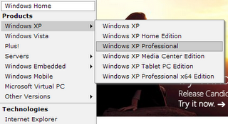
The Fly-out has an old standard at Microsoft.com. It conserves space well because menu items are generally hidden, and when exposed the fly-out menus overlay the page content. These were made popular on the web mainly with DHTML where the menu functionality could be made fast enough to not be an irritant. These fly-out menus can be horizontal or vertical.
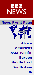
Horizontal and Vertical navigationThis consists of a horizontal bar with hyperlinks laid side to side. Usually appears at the top of a page. Use this when you want the navigation item to be visible throughout your site or app. The current page is usually highlighted on the horizontal navigation bar. The position of this navigation bar at the top of the page can be a hindrance if your page content requires users to scroll down.

When sub-categories exist, it is not uncommon to employ the double horizontal navigation pattern. The law of diminishing returns applies with each added level.

Another variant is the Vertical Navigation menu. These menus suffer some of the same disadvantages as their Horizontal cousins. However, their main advantage is in their scalability. Scrolling vertically is seen as less of an irritant as scrolling horizontally.
Tabbed navigationTabs extend the horizontal navigation menu concept further. They allow categorizing content where top level items are fairly static. They also provide visual cues that suggest ownership over a page's content. The double tabular form has two levels where the top level is static and the bottom level changes based on top level selection.

This post does not aim to be comprehensive. I hope it got you thinking about navigation paradigms. So in closing...
Questions to the WPF community:- Would you consider it valuable if there were high-level, native support for these navigation patterns in WPF? If so, which ones?
- Would you like to create one or more controls based on these patterns? If so, drop me a comment. I'll be happy to post them to the WPF community site.
- Are there other important navigation paradigms that I missed? Any that you'd like to see WPF versions of?
Tags: WinFX, NetFX3, WPF, XBAP, RIA, Web Design Patterns