
|
Advertisements
|
||
|
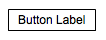
In a previous article, Skinning Components in Flex 4, I showed the basics of creating custom skins for spark components, and showed how to use the new graphics tags in Flex 4 to create a very simple skin for a button. In that version of the component, we saw the label of the button surrounded by a rectangle:
This skin did the job and we ended up with something that looked vaguely like a button. But modern UIs demand graphics that look richer and more compelling. The days of simple white-and-black rectangles on the screen stopped being popular about the same time as Milli Vanilli. Fortunately, the new graphics capabilities of Flex 4 make it easy to add rich graphics to your component skins. We will see how to make this happen in this article.
Run the demo below. First, select the Padded item in the dropdown list; the button will now show the simple skin we developed in the last article. Now select the Shadowed item to see the richer version that we're aiming for here.
To view this page ensure that Adobe Flash Player version 10.0.0 or greater is installed.
Either scripts and active content are not permitted to run or Adobe Flash Player version 10.0.0 or greater is not installed.

There are several elements that go into the Shadowed skin which we'll cover here, including a rounded rectangle, a gradient background, and a drop shadow.
The previous version of this skin simply drew a black rectangle around the component, to delineate the border of the object:
    <s:Rect top="0" left="0" right="0" bottom="0">
        <s:stroke>
            <s:SolidColorStroke color="black"/>
        </s:stroke>
    </s:Rect>
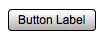
Instead of this rather boring rectangle, we want to have rounded corders to soften the object and a linear gradient to give the object a psuedo-3D look and make it stand out from the background. The following code in the skin will give us both of these effects:
    <s:Rect top="0" left="0" right="0" bottom="0"
            radiusX="3" radiusY="3">
        <s:fill>
            <s:LinearGradient rotation="90">
                <s:GradientEntry color="0xf0f0f0"/>
                <s:GradientEntry color="0xffffff" ratio=".1"/>
                <s:GradientEntry color="0xaaaaaa"/>
            </s:LinearGradient>
        </s:fill></s:Rect>
        <s:stroke>
            <s:SolidColorStroke color="black"/>
        </s:stroke>
    </s:Rect>
There are a few things to note in this code. First of all, the stroke object is the same as it was in the previous (boring) version of the skin. We are not changing what we are drawing (a black border), but rather how we are drawing it (as a rounded rectangle instead of a a rectangle with squared-off corners). The cornders achieve their roundedness through the radiusX and radiusY properties in the Reect object itself. Next, there is a fill object to take care of filling the inside of the rectangle. Previously, the rectangle was drawn purely as an outline. Now, we draw the outline with the stroke object and also the inside of the rectangle with this fill object. Finally, the fill is just a solid color, but instead uses a LinearGradient to get a nice, rich effect for that background. If you select the Rounded item in the dropdown list of the demo, you'll see the following version of the button, with the rounded corners and gradient changes above:
By the way, the topic of gradients is, like the component skin's fill, very rich indeed, and one that I will not cover here. Instead, I'd encourage you to check out the Graphics chapter of Flex 4 Fun, which happens to be available for free download on the book's site.
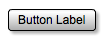
As one final step toward modernizing our component, let's add a drop shadow. Shadow effects are a simple way to make objects stand out from the background of the application, by giving them a subtle visual cue that they are literally standing out in front of the plane of the UI, enough to cast a small shadow. We can achieve this simple effect by first declaring a DropShadowFilter in the Declarations block of the skin file:
    <fx:Declarations>
        <s:DropShadowFilter id="shadow" strength=".3"/>
    </fx:Declarations>
Next, we attach the drop shadow as a filter to our Rect object by setting its filters attribute:
    <s:Rect top="0" left="0" right="0" bottom="0"
        radiusX="3" radiusY="3" filters="{[shadow]}">
Now select the Shadowed item in the dropdown list and you'll see this final version, incorporating the previous rounded/filled graphics with this drop shadow:
Like gradients, filters are a deep topic that goes way beyond the scope of this little article, so I will leave the details of this effect for elsewhere. In particular, the DropShadowFilter is discussed along with other blur-based filters and Flex 4 filters in general in Flex 4 Fun's chapter entitled (not surprisingly) Filters.
We have seen how to add other graphical objects and effects form Flex 4 to our simple component skin to change it from a basic and boring button into one that is much more modern and compelling. These changes show the power of spark skins; through simple changes in the skin's MXML, we can effect large and powerful changes in the look of the application's user interface.
Resources
 |
Chet Haase is author of Flex 4 Fun, which is available as a PrePrint™ (early access release) at: http://www.artima.com/shop/flex_4_fun |
Adobe's Flash Builder 4
http://www.adobe.com/products/flashbuilder
Flex SDK 4
http://opensource.adobe.com/wiki/display/flexsdk/Flex+SDK
For more on states in Flex 4, see "Working with States in Flex 4":
http://www.artima.com/articles/flex_4_states.html
Flex.org
http://www.flex.org
Talk back!
Have an opinion? Be the first to post a comment about this article.
About the author
Chet Haase worked as a senior computer scientist on the Flex SDK team at Adobe Systems, Inc., during the Flex 4 release. He was responsible for Flex effects, and writing the next effects infrastructure and classes for Flex 4. Prior to his work at Adobe, he worked at Sun Microsystems for several years, and co-authored the book Filthy Rich Clients about creating rich user experiences with the Java client platform. His entire career has been in graphics software, from the application level to APIs and libraries to drivers for graphics chips. As long as it puts pixels on the screen, he's interested. He earned a B.A. in Mathematics from Carleton College and an M.S. in Computer and Information Sciences from the University of Oregon.
Chet posts regularly to his technical blog at http://graphics-geek.blogspot.com, where you can find articles, videos, demos, and plenty of source code. Chet is also interested in writing and performing comedy; you can see some his work in this completely unrelated field at http://chetchat.blogspot.com, and in his book When I am King..., which is available at Amazon.com.
Artima provides consulting and training services to help you make the most of Scala, reactive
and functional programming, enterprise systems, big data, and testing.
2070 N Broadway Unit 305
Walnut Creek CA 94597
USA
(925) 918-1769 (Phone)