This post originated from an RSS feed registered with .NET Buzz
by Frank Hileman.
Original Post: Translucent Gel Buttons in VG.net
Feed Title: Frank Hileman's Blog
Feed URL: http://weblogs.asp.net/frank_hileman/rss?containerid=13
Feed Description: Vector Graphics with VG.net, MyXaml, and Visual Studio Integration
In this article, I explain how to create a translucent (or transparent) gel button component in VG.net. This gel button is pure vector graphics; no bitmaps are used.
Gel buttons are easy. The hard part is the artistry – how to get the right “look.” I used the Picture designer integrated in Visual Studio .NET to create this button.
First, we add a Picture to the project, called TransparentButton. Then we add each visual component of the button to the Picture, and style each one. Finally, we add custom properties and behavior.
There are three rounded rectangles in TransparentButton:
background: the body, containing the most color, and the text displayed.
highlight: provides a light gradient from the top down.
shine: a shiny reflection of the light sources near the top.
The background rectangle delimits the bounds of the TransparentButton:
The highlight provides some of the lighting effect. You can do this with a Path, but a rectangle works well enough. The highlight has the same corner radius as the background, but is much smaller vertically, and offset slightly from the upper left corner of the background. Fill the rectangle with a gradient that fades to transparent at the bottom:
The shine is the most “artsy” part. It is even smaller than the highlight, and offset even further from the upper left. It also fades to transparent:
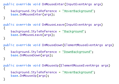
Each component has a corresponding Style object defined. To change the look when the mouse hovers over the button, we define a Style named “HoverBackground”. A Style named “DownBackground” is used when the mouse is pressed down on the button:
Here is the mouse event code to change Styles:
To enable a TransparentButton user to change the button text, we provide a Text property:
We do not want a TransparentButton to be scaled when it is resized in the designer. We can override the new function, SetBoundsCore, to provide a custom resizing algorithm. Note that this function is not available in beta 1.7:
 Previous Topic