
|
Advertisements
|
||
|
In a previous article, Rich Component Skins in Flex 4, I showed how to use the new graphics and filter tags in Flex 4 to liven up the skin for a button with modern visual elements. In that version of the component, the button looks pretty good: it's distinctive, it's modern-looking, it has an attractive shadow, and it has a rich gradient fill, which is very trendy in today's UIs. But try to interact with it. When you hover over the button, and then click on it, notice what happens: nothing. The mouse actions are actually having an effect; the button detects mouse hover and click actions; it's furiously dispatching events under the hood as these things happen. And the component is also telling the button skin to set its state appropriately as these actions occur. When the button hovers over the button, the skin is set to the over state, and when the mouse pressed down on the button the skin is set to the down state. But none of these exciting changes are reflected in what the user sees on the screen, so they are left wondering what's going on and whether the application has died a cruel and unusually boring death.
Let's fix this problem: let's actually tell the user what's happening in the UI. Let's use skin states.
Visual feedback is a critical factor in good user interfaces. UI design is not just about making things look pretty; it's about making functional, intuitive, and productive interfaces that help the user rather than confuse them.
You can help the user understand the state of the component and the state of the application overall. Give the user visual cues for simple actions. Change the look of a component when the mouse is hovering over it to communicate that the component is in a different state and is ready to accept a click action. Change the look when the mouse presses down on a component to provide a clue that the user is performing that action. Don't leave the user guessing---use states to give them important visual cues about exactly what's going on.
Now let's see how we can help the user understand the button's state. Run the application below and select the Stateful item in the drop down list. When you do this, the button uses the StatefulSkin skin class.
To view this page ensure that Adobe Flash Player version 10.0.0 or greater is installed.
Either scripts and active content are not permitted to run or Adobe Flash Player version 10.0.0 or greater is not installed.

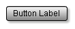
The Stateful skin class starts from where the previous article's skin class, ShadowedSkin, leaves off. Initially, the button looks identical to the previous ShadowedSkin incarnation on which it is based:
Now move the mouse over the button. Aha! The look of the button change as the mouse moves into the button area.
Now click on the button. Aha, again! The button changes its appearance again when the button is pressed.
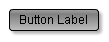
Let's look at the code that was added in this version of the skin to make these state indications happen:
    <s:fill>
        <s:LinearGradient rotation="90">
            <s:GradientEntry color="0xf0f0f0"
                color.over="0xc0c0c0" color.down="0xa0a0a0"/>
            <s:GradientEntry color="0xffffff"
                color.over="0xf0f0f0" color.down="0x808080"
                ratio=".1" ratio.down=".2"/>
            <s:GradientEntry color="0xaaaaaa"
                color.over="0x808080" color.down="0xc0c0c0"/>
        </s:LinearGradient>
    </s:fill>
You can see that this skin code started with the same linear gradient structure from the previous version of the skin: all of the entries, colors, and ratios are the same for the defaults. So the button looks the same when it is first shown because it is initially in the up state, in which these defaults are used. But when the button enters the over state, which happens when the mouse is over the button and the button component tells the skin to switch to that state, different colors are used for all three gradient entries. The new colors are basically darker versions of the earlier colors, so the button looks similarly lit, but darker.
When the button is clicked, the colors change again, along with the ratio of the second gradient entry. This time, the colors are changed to make the button have more of a pushed-in look, so that it looks like the bottom of the button is being lit from above, as it might if the button were concave.
The actual way in which skins reflect changes to state is completely flexible; I happened to choose this approach because it suited me, but you should experiment to find a look that you like for your components. The most important thing is to give the user some visual indication of state change. States are supported in skins for a good reason; giving the user visual cues for component state is a critical feature in good UI design.
Resources
 |
Chet Haase is author of Flex 4 Fun, which is available as a PrePrint™ (early access release) at: http://www.artima.com/shop/flex_4_fun |
Adobe's Flash Builder 4
http://www.adobe.com/products/flashbuilder
Flex SDK 4
http://opensource.adobe.com/wiki/display/flexsdk/Flex+SDK
For more on states in Flex 4, see "Working with States in Flex 4":
http://www.artima.com/articles/flex_4_states.html
Flex.org
http://www.flex.org
Talk back!
Have an opinion? Be the first to post a comment about this article.
About the author
Chet Haase worked as a senior computer scientist on the Flex SDK team at Adobe Systems, Inc., during the Flex 4 release. He was responsible for Flex effects, and writing the next effects infrastructure and classes for Flex 4. Prior to his work at Adobe, he worked at Sun Microsystems for several years, and co-authored the book Filthy Rich Clients about creating rich user experiences with the Java client platform. His entire career has been in graphics software, from the application level to APIs and libraries to drivers for graphics chips. As long as it puts pixels on the screen, he's interested. He earned a B.A. in Mathematics from Carleton College and an M.S. in Computer and Information Sciences from the University of Oregon.
Chet posts regularly to his technical blog at http://graphics-geek.blogspot.com, where you can find articles, videos, demos, and plenty of source code. Chet is also interested in writing and performing comedy; you can see some his work in this completely unrelated field at http://chetchat.blogspot.com, and in his book When I am King..., which is available at Amazon.com.
Artima provides consulting and training services to help you make the most of Scala, reactive
and functional programming, enterprise systems, big data, and testing.
2070 N Broadway Unit 305
Walnut Creek CA 94597
USA
(925) 918-1769 (Phone)