
|
Advertisements
|
||
|
One of the major themes behind the Flex 4 release is the new component model. In Flex 4, the control of each component has been separated from its appearance. The component is now responsible for the logic of its behavior (like what a Button does when it is clicked). The component's skin is responsible for the visual appearance of the component (like what the Button's border looks like).
A component's skin is an MXML file that contains all of the data necessary for associating the skin with its host component and creating whatever custom visuals you want to use to display the control. For example, here's a simple skin class, JustALabelSkin, that displays just a text string for the button that it represents:
<?xml version="1.0" encoding="utf-8"?>
<s:Skin xmlns:fx="http://ns.adobe.com/mxml/2009"
        xmlns:s="library://ns.adobe.com/flex/spark">
    <fx:Metadata>
        [HostComponent("spark.components.Button")]
    </fx:Metadata>
    <s:states>
        <s:State name="up"/>
        <s:State name="over"/>
        <s:State name="down"/>
        <s:State name="disabled"/>
    </s:states>
    <s:Label id="labelDisplay"/>
</s:Skin>
The Metadata and states sections of the code above are responsible for the data connection to the component and the component state interaction, respectively. I won't discuss those here (though they're covered in detail in Flex 4 Fun, in the "Skinning Components" chapter from which this article is derived). Instead, I'll focus on just the last item, which is the set of visuals that the component will display in the UI.
The way that the component and its visuals are connected is through the skinClass property on spark components (which tells the component which file to use for its skin, defaulting to standard skin files that ship with the Flex 4 SDK), and through a contract on the component about the "skin parts" that a skin for that component must have. In this case, the only skin part that a Button skin must have is labelDisplay, which you can see is the id assigned to the Label element. So if you declare a Button in your application and assign it a skinClass of the skin file above, the button will automatically display the Label element when it is rendered into the UI.
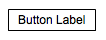
Our custom button skin in the previous example leaves much to be desired. In fact, the "button" doesn't really look like a button; it's really just a label with some hidden button logic. You can see this in the ButtonSkinSampler demo from Flex 4 Fun, embedded below. Choose the "Label" item from the drop down list to see the results of using the JustALabelSkin class for the button.This same application is used for the other skin examples below (as well as several other skin examples that we don't have space to cover in this article, but which are explained in glorious detail in the book).
To view this page ensure that Adobe Flash Player version 10.0.0 or greater is installed.
Either scripts and active content are not permitted to run or Adobe Flash Player version 10.0.0 or greater is not installed.

A little graphics would go a long way toward making a real button. In fact, without some graphics to define the bounds of the button, we can't even tell what that button area is. Text elements without borders work fine because they are just informational elements in the UI. But objects that the user needs to interact with like buttons should have a more clearly defined area so that the user knows where to click the mouse. But perhaps most importantly, the user comes into any UI experience with a history of knowledge in using other UIs; you should make your interface easy for them to understand by using similar objects and UI metaphors, like buttons that look like buttons and not like floating text objects. Using our knowledge of MXML graphics tags, we can add a border to the button and then center the text inside of it.
The skin class BorderSkin starts from the previous JustaLabelSkin, but adds the following Rect object:
<s:Rect top="0" left="0" right="0" bottom="0">
    <s:stroke>
        <s:SolidColorStroke color="black"/>
    </s:stroke>
</s:Rect>
This rectangle draws a border around the button area, which helps define the boundaries of the component. The layout constraints top, left, right, and bottom are used to make sure that the border is stretched to the edges of the component. But as you can see from the image below, or by selecting the "Border" item in the application above, this doesn't actually make for a very attractive button:
The problem is that the button has been sized to the minimum dimensions that fit the label text, so that the border is crammed into this tight area with the text, resulting in a pretty awful looking component. We need to give these elements some space.
The next drop down item in the ButtonSkinSampler application, Padded, selects the PaddedBorderSkin skin class, which adds the padding that the button needs. This skin class is a copy of the previous BorderSkin, but modifes the labelDisplay element to the following:
<s:Label id="labelDisplay"
    left="10" right="10" top="5" bottom="5"
    horizontalCenter="0" verticalCenter="1"/>
The use of these layout constraints ensures both padding between the text and the sides of the component and that the text is centered within the overall component bounds.
We can continue, in a similar way, to add more, and more interesting, elements to the button, such as rounded corners and a gradient background. We can (and should) also add states information to the skin so that the button reacts to user interaction with the button, such as hovering the mouse over it or clicking on it. We can even add richer graphics, such as drop shadows and animation.
We can do all these things ... and in fact that's what the "Skinning Components" chapter of the book does. You can see the results of progressively more interesting, rich, and interactive button skins in that chapter, and in the example application above. Play with the application to see how a little more graphics and a little more interactivity makes for a more compelling, more useful, and more custom component.
You can skin many more, and much more complex, components than the simple Button covered here and in the "Skinning Components" chapter of the book. For example, the ScrollBar control has four optional parts to play around with, compared with Button's single labelDisplay part. You can also create skinned containers and data containers as well. We have just covered the basics here for the simple case of Button, but the same principles and skinning contract apply for every Flex 4 component.
Resources
 |
Chet Haase is author of Flex 4 Fun, which is available as a PrePrint™ (early access release) at: http://www.artima.com/shop/flex_4_fun |
Adobe's Flash Builder 4
http://www.adobe.com/products/flashbuilder
Flex SDK 4
http://opensource.adobe.com/wiki/display/flexsdk/Flex+SDK
For more on states in Flex 4, see "Working with States in Flex 4":
http://www.artima.com/articles/flex_4_states.html
Flex.org
http://www.flex.org
Talk back!
Have an opinion? Be the first to post a comment about this article.
About the author
Chet Haase worked as a senior computer scientist on the Flex SDK team at Adobe Systems, Inc., during the Flex 4 release. He was responsible for Flex effects, and writing the next effects infrastructure and classes for Flex 4. Prior to his work at Adobe, he worked at Sun Microsystems for several years, and co-authored the book Filthy Rich Clients about creating rich user experiences with the Java client platform. His entire career has been in graphics software, from the application level to APIs and libraries to drivers for graphics chips. As long as it puts pixels on the screen, he's interested. He earned a B.A. in Mathematics from Carleton College and an M.S. in Computer and Information Sciences from the University of Oregon.
Chet posts regularly to his technical blog at http://graphics-geek.blogspot.com, where you can find articles, videos, demos, and plenty of source code. Chet is also interested in writing and performing comedy; you can see some his work in this completely unrelated field at http://chetchat.blogspot.com, and in his book When I am King..., which is available at Amazon.com.
Artima provides consulting and training services to help you make the most of Scala, reactive
and functional programming, enterprise systems, big data, and testing.
2070 N Broadway Unit 305
Walnut Creek CA 94597
USA
(925) 918-1769 (Phone)